Purpose
Describe the PageBuilder directory structure and the PageBuilder Editor user interface (UI)
Purpose
Describe the PageBuilder directory structure and the PageBuilder Editor user interface (UI)
Audience
Developers and content managers who want to understand the PageBuilder structure and PageBuilder Editor UI
The Arc Fusion CLI provides a Feature Pack skeleton in a directory structure to support project development. This document explains the directory structure and introduces the PageBuilder Editor UI.
The init method from the npx @arc-fusion/cli init command generates a directory structure that organizes folders and files by their specific purposes and functionalities within Arc XP. The following snippet shows the directory structure:
.├── components│ ├── chains│ ├── features│ ├── layouts│ └── output-types├── content│ ├── schemas│ └── sources├── data│ ├── dumps│ └── restore├── environment├── mocks│ ├── apps│ ├── settings│ │ └── api│ │ └── v1│ │ └── user│ │ └── pinned│ ├── siteservice│ │ └── api│ │ └── v3│ │ └── website│ └── user├── node_modules├── properties│ ├── index.json│ └── sites├── resources├── package-lock.json└── package.jsonTo learn more about testing Arc XP’s core functionalities in your local machine, see Setting Up Your Dev Playground.
This section describes the project directories and their contents.
/components/: Contains the React components that define the structure of your Feature Pack. These components are organized into subdirectories by type:
chains/: Code for Chain components.features/: Code for Feature components.layouts/: Code for Layout components.output-types/: Code for Output-Type components./content/: Defines the sources and structure of the data Feature Pack components consume.
schemas/: Contains JSON files that define the structure and validation rules for content types used in your Feature Pack.sources/: Contains code for defining content sources your Feature Pack consumes./data/: Contains artifacts related to database management.
dumps/: Stores exported database dumps.restore/: Includes scripts and tools for manually restoring your database from a tarball./environment/: Stores server-only environment variables, often encrypted for secret values like credentials./mocks/: Enables local development by serving mock resources directly from the root of your website. Use this directory to simplify testing and development workflows. For more information, see Local Mocks.
/node_modules/: Stores the locally installed Node modules for your application.
/properties/: Contains non-secret site properties that can vary on a per-site basis. These properties are accessible in components.
sites/: Contains site-specific overrides of the default site properties.index.js or index.json: Stores the default site properties, either as a JavaScript object or a JSON file./resources/: Contains static resources such as images, CSS files, fonts, and other assets that do not require processing./package-lock.json: A lockfile for dependencies listed in package.json. Treat as read-only. For more information, see package-lock.json./package.json: Declares your application’s dependencies and scripts. You can edit this file to manage your project’s configurations. For more information, see package.json./.dockerignore: Specifies files and directories to ignore when creating Docker images. Treat as read-only. For more information, see .dockerignore file./.env: Stores environment variables specific to your development environment. Git ignores this file, but Docker and PageBuilder use it. For more information, see How to use environment variables and secrets./.gitignore: Specifies files and directories that Git ignores. For more information, see gitignore.PageBuilder Editor is a tool for building and managing your site’s pages and templates. It integrates with Fusion Engine, Arc’s rendering engine, to encode information about site content and define its layout and appearance.
The PageBuilder Editor UI consists of 13 categories, as illustrated in Figures 1 to 3.
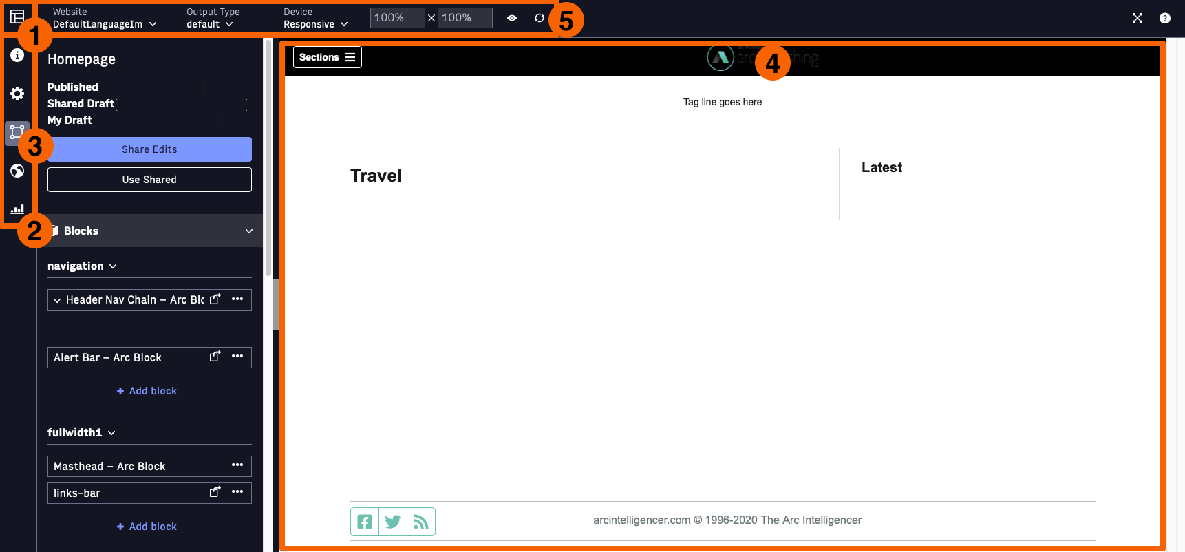
Figure 1. PageBuilder Editor User Interface
Table 1 lists the UI elements displayed in Figure 1.
| UI Component | Description |
|---|---|
| 1 | PageBuilder Landing: Displays the main PageBuilder Editor landing page, listing all pages or templates. |
| 2 | Workspaces Bar: Displays the different workspaces available in the PageBuilder Editor. |
| 3 | Curate Workspace: Displays the primary workspace for users to curate content, add features or chains, and preview updates. |
| 4 | Editor Preview: Shows real-time updates of your draft page as you modify content, elements, and custom fields. |
| 5 | Editor Tool Bar: Offers dropdown menus for previewing your page draft on various devices, selecting output types, and visualizing design layouts through customized aspect ratios. |
Table 1. PageBuilder Editor UI Components
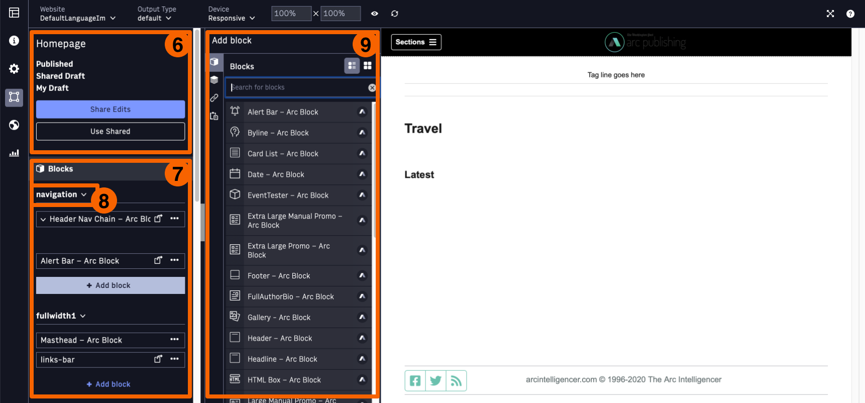
Figure 2. PageBuilder Editor User Interface
Table 2 lists the UI elements displayed in Figure 2.
| UI Component | Description |
|---|---|
| 6 | Status Card: Provides current information on the live page version, shared and personal drafts across all workspaces, and options to share edits and revert drafts. |
| 7 | Blocks and Chains Card: Displays layout zones and the features or chains of your page within the Curation workspace. Hovering over a block or chain name navigates you to its preview. |
| 8 | Layout Zone: Defines the regions of your page based on the Page Layout established in the Set-up workspace, offering design and layout flexibility. |
| 9 | Add Block or Chain Modal: Opens a modal that lets you add blocks or chains from lists, other pages, or the clipboard. |
Table 2. PageBuilder Editor UI Components
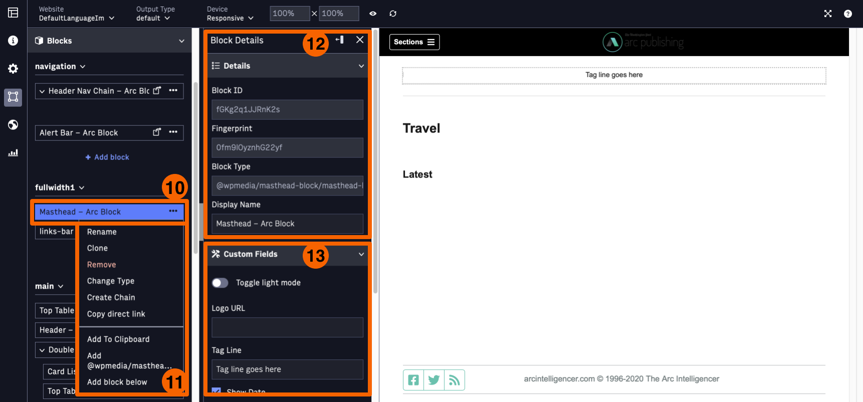
Figure 3. PageBuilder Editor User Interface
Table 3 lists the UI elements displayed in Figure 3.
| UI Component | Description |
|---|---|
| 10 | Block or Chain Actions Menu: Provides a three-dot menu offering actions for blocks or chains. |
| 11 | Block or Chain Actions: Lists available actions for a selected block or chain, including renaming, deleting, and changing type. |
| 12 | Back to Blocks and Chains: Navigates back to the main Curation workspace from the card interface. |
| 13 | Card: Displays metadata, custom curation fields, and linking options for a selected block or chain. |
Table 3. PageBuilder Editor UI Components